
SAFECALL
It all begins with an idea
THE PROBLEM
-
✺
Only 25% of calls made by
Westpac bankers to customers awere being answered -
✺
An increase in impersonation scams, customers are lacking trust and are reluctant to interact over a phone call
-
✺
$208 million lost to scams by Westpac customers in 2023. Reputation damage the bank couldn’t quanitfy and an erosion of customer trust
MY ROLE
I was the lead designer across the end-to-end execution, owning the UX strategy, Ul design and the creative and technical decisions that determined whether SafeCall would feel trustworthy enough to actually change customer behaviour.
This wasn't an execution role. I drove the strategic design decisions across a genuinely complex, cross-functional build: Westpac engineering, Optus telecommunications infrastructure, Legal, Compliance, and the Contact Centre. I also owned the prototype that secured $10 million in executive funding to take the project from proof of concept to full delivery.
The outcome of this project, determine by whether customers would answer depended almost entirely on whether the design could establish trust in the first second. That was the standard I worked to.
SafeCall wasn't a standard feature build. It required integrating Optus telecommunication infrastructure with Westpac's native banking app across two platforms. Each with different system behaviours, permission architectures and CallKit and capability constraints.
The design decisions I owned weren't just UX choices. They had direct consequences for security, compliance, and customer simultaneously. Getting the hierarchy wrong on a single screen could undermine the entire feature. Getting the permission flow wrong could kill adoption before the product had a chance.
Understanding this deeply, before touching Figma was one of the most important decisions I made on this project.
DESIGNING AN AUSTRALIAN BANKING FIRST
DESIGNING AN AUSTRALIAN BANKING FIRST
DISCOVERY
DESIGN

PIVOTAL DECISIONS
At this stage, three solution decisions had significant downstream consequences for the user experience. Each require+ holding technical constraints, user user psychology, and business requirements simultaneously.


-
I began by running sessions with cross-functional teams to develop a genuine working understanding of CallKit technology and the material differences between iOS and Android that would shape the experience structurally. I mapped the existing contact and app architecture to understand exactly where SafeCall would need to sit -and what the transitions between systems would feel like to a customer under stress.
Three things became clear from this research:
The active call screen was everything. If a customer hesitated or doubted what they were looking at in that moment, the feature had already failed.
The seams between systems were the biggest usability risk. Native-to-web transitions, permission logic, and multi-device behaviour all had the potential to introduce exactly the kind of confusion scammers exploit. Everyone one of those seams needed a design solution.
Trust and clarity couldn't be assumed. They had to be designed, deliberately, at every step.
This wasn't background context. It became the foundation every subsequent decision was built on.
-
I established three principles to govern every decision across the UX and Ul:
Trust is established in the first second - the active call screen was the centrepiece of the entire experience. Westpac name, call context and Optus verification had to land immediately and unambiguously. Hierarchy, not decoration, was the design tool.
Complexity belongs behind the interface, not in it - SafeCall involved backend integrations across two organisations, platform-specific CallKit behaviour, OTP flows, and layered permission logic. None of that belonged in front of the customer. Every decision was made to absorb the complexity, not expose.
Security cannot create the feelings it exists to prevent - scammers exploit confusion, urgency and overwhelm. The legitimate call experience had to be the opposite: calm, sequential, and unambiguous at every step.
KICK OFF
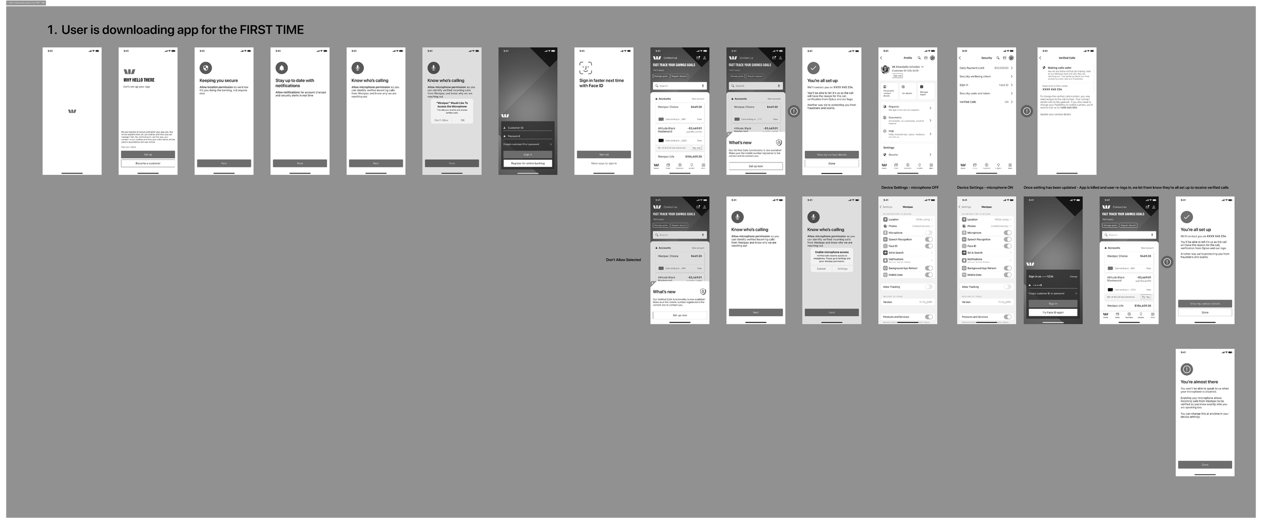
I mapped every journey and user flow before touching Figma — forcing clarity on the key interactions and decisions before any visual work began. Once I had genuine depth on the technology and the flows, I moved into low fidelity wireframes to rapidly test screen structures and information hierarchy, particularly for the active call screens where the design stakes were highest.
-
Using the customer's existing OTP number was the right security decision but it created a jarring native-to-web transition mid-flow. I resolved this through carefully positioned native load screens, explicit user feedback states and a forced return to the native flow once the update was complete. The seam was still there. The customer wouldn't feel it.on text goes here
-
Calls would only ring on one registered device. The deliberate reason: the confusion of a call arriving across multiple devices is precisely the kind of disorientation scammers manufacture. A single-device experience eliminated that entirely from registration through to the active call.
-
iOS required microphone and notification permissions. Android required phone, microphone, full screen alerts and notifications. I had to balance transparency, explaining why each permission was needed - against legal and compliance requirements, friction minimisation and the business need to drive SafeCall adoption. I landed on requesting permissions once at first interaction, then only again at the next relevant touchpoint. Maximum uptake, minimum overwhelm.
WIREFRAMES & STAKEHOLDER ALIGNMENT
I engaged senior stakeholders early and consistently throughout wireframes. The result: by the time we reached high fidelity, feedback was scoped to copy and language refinements - not structural rework. This wasn't process compliance. It was a deliberate strategy to protect delivery timelines and keep the team aligned without sacrificing design rigour.
HIGH FIDELITY DESIGN
With structure locked, I moved into high fidelity using the Westpac component library as the foundation, ensuring coherence with the broader app and reducing development overhead significantly.
The active call screen received the most intensive design attention. The information hierarchy had to communicate trust instantly: Westpac name, call context, Optus verification - in exactly the right order, at exactly the right visual weight. I worked closely with a fellow designer throughout this stage to pressure-test decisions and surface usability issues before they reached development.
I built a fully interactive prototype across both platforms including real touch targets, animations and transitions refined until the experience felt seamless. The fidelity was deliberate. At Board level, what you show signals the quality of what you're proposing.
KICK OFF
THE PITCH
KICK OFF
The prototype was presented to the Executive team as the centrepiece of the funding case.
The decision: $10 million approved.
SafeCall moved from proof of concept to full delivery.
HIGH FIDELITY DESIGN
BUILD, QA & USER TESTING
I worked directly with developers through QA across iOS and Android - testing not just UI fidelity but functional accuracy. When the build was stable, I set up the contact centre test environment and initiated SafeCall sessions myself to validate the end-to-end experience.
Internal usability testing was conducted across teams and skillsets returned positive feedback. One key finding: users expected tapping the Westpac app button to navigate directly to the active call screen. This was prioritised and resolved in the next phase.
Running testing on work I had designed required deliberate separation of ego from outcome. The feedback made the product better.
GOING TO MARKET
SafeCall launched publicly as a market-first initiative, the first verified, in-app secure calling feature of its kind offered by an Australian bank.
The announcement positioned Westpac as leading the industry response to impersonation scams at a moment when customer trust in banking calls was at a low.
Phase 1 launched as an internal pilot. Phase 2 rolled out to customers. The product continues to iterate as scam behaviour evolves.
RESULTS & IMPACT
Increased Adoption
calls answered have increased by 25% in the first 3 months
Brand Trust
Contributed to increasing westpac’s nps from 2 to 3 IN FIRST HALF 2024
Executive Funding Approved
$10 MILLION IN FUNDING SECURED AT PROOF OF CONCEPT STAGE
Market First
ESTABLISHED AS AUSTRALIAN BANKING FIRST, PUBLICALLY ANNOUNCED
REFLECTION
SafeCall pushed me into territory most designers don't get near: owning the design strategy for a cross-organisational security feature where the stakes whether financial, reputational or human - were immediate and real.
What I learned about leading at this level:
Understand the technology before you design - I couldn't have made defensible decisions on OTP flows, CallKit constraints or permission architecture without genuinely understanding the systems involved. That understanding wasn't background research. It was the basis of every creative decision I made.
Early alignment is a design strategy - bringing stakeholders in before visual decisions were made wasn't process compliance. It's what allowed high-fidelity work to move without structural rework. Speed at the end came from discipline at the start.
The work has to work in the room - the prototype didn't demonstrate what SafeCall looked like. It made executives feel why it would work and why it was worth funding. That's the standard I build prototypes to.
I'll continue to bring this approach - technically grounded, strategically led, unafraid of complexity with every team I work with.
